
From Behind Closed Doors
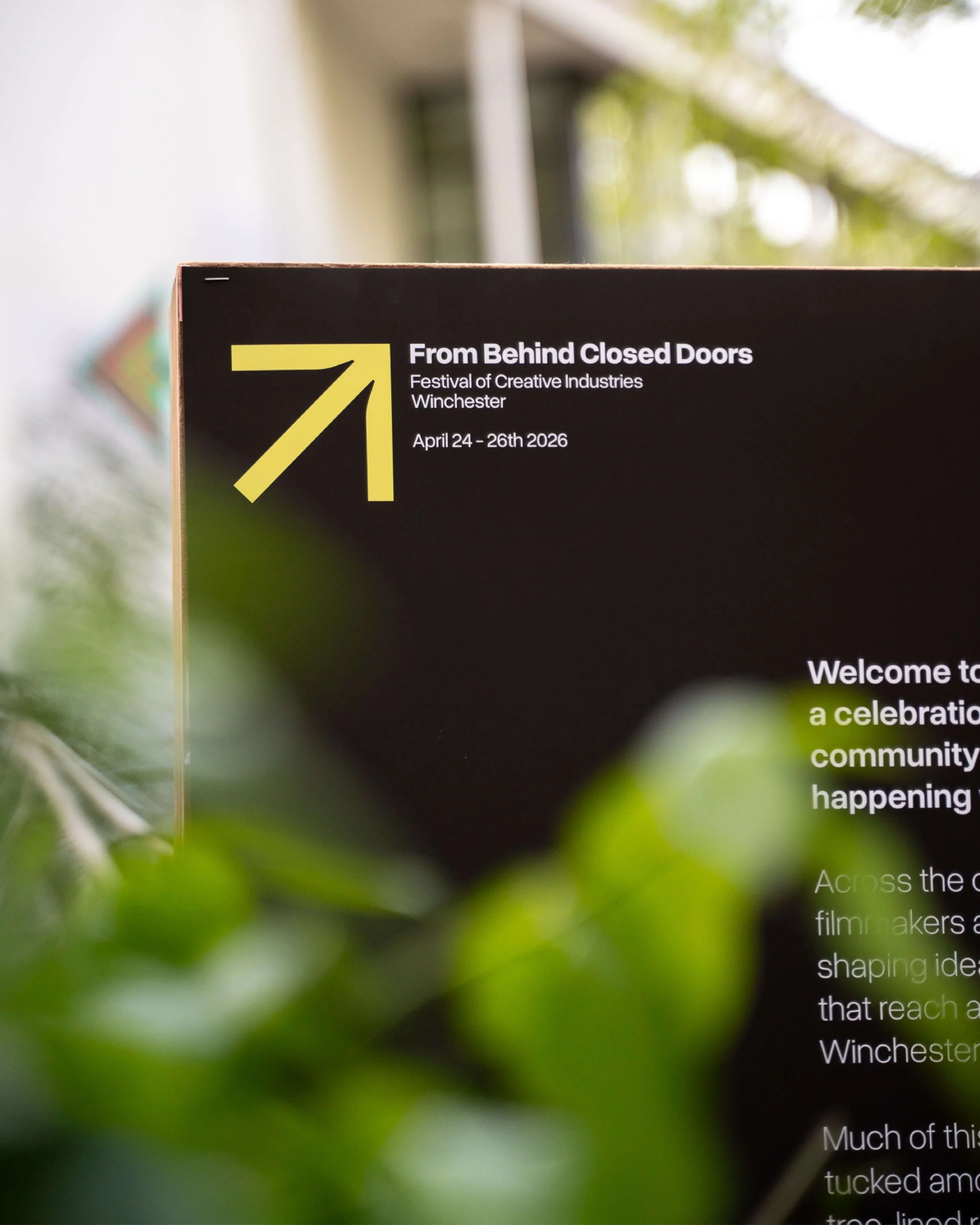
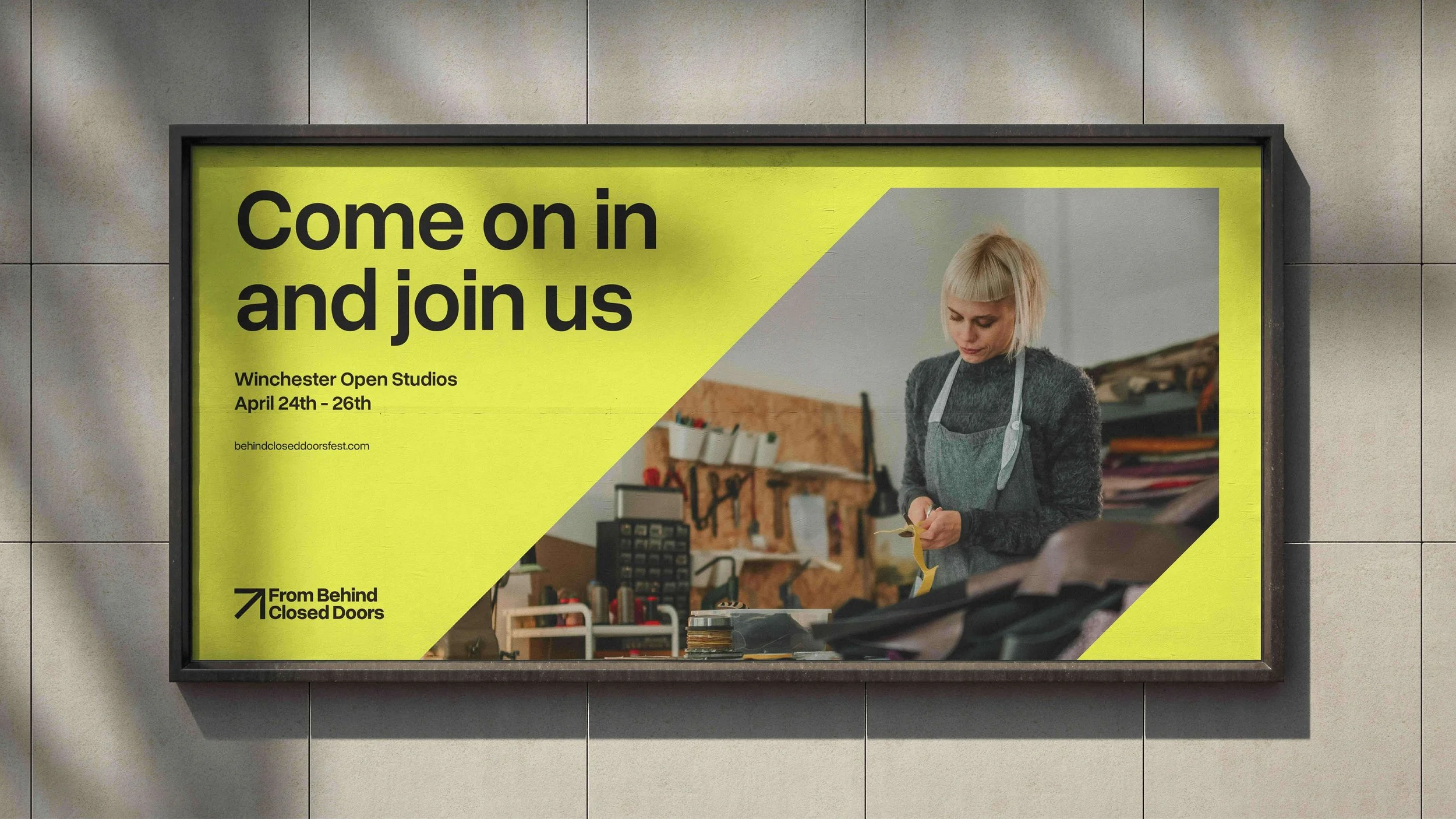
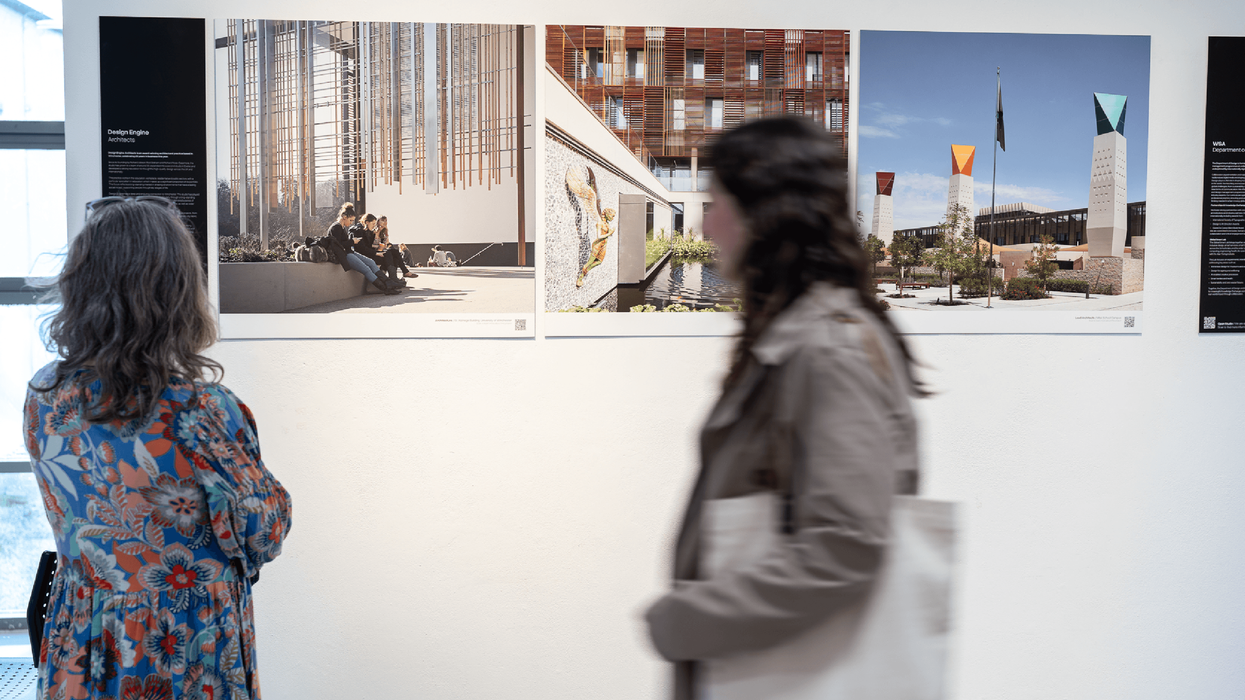
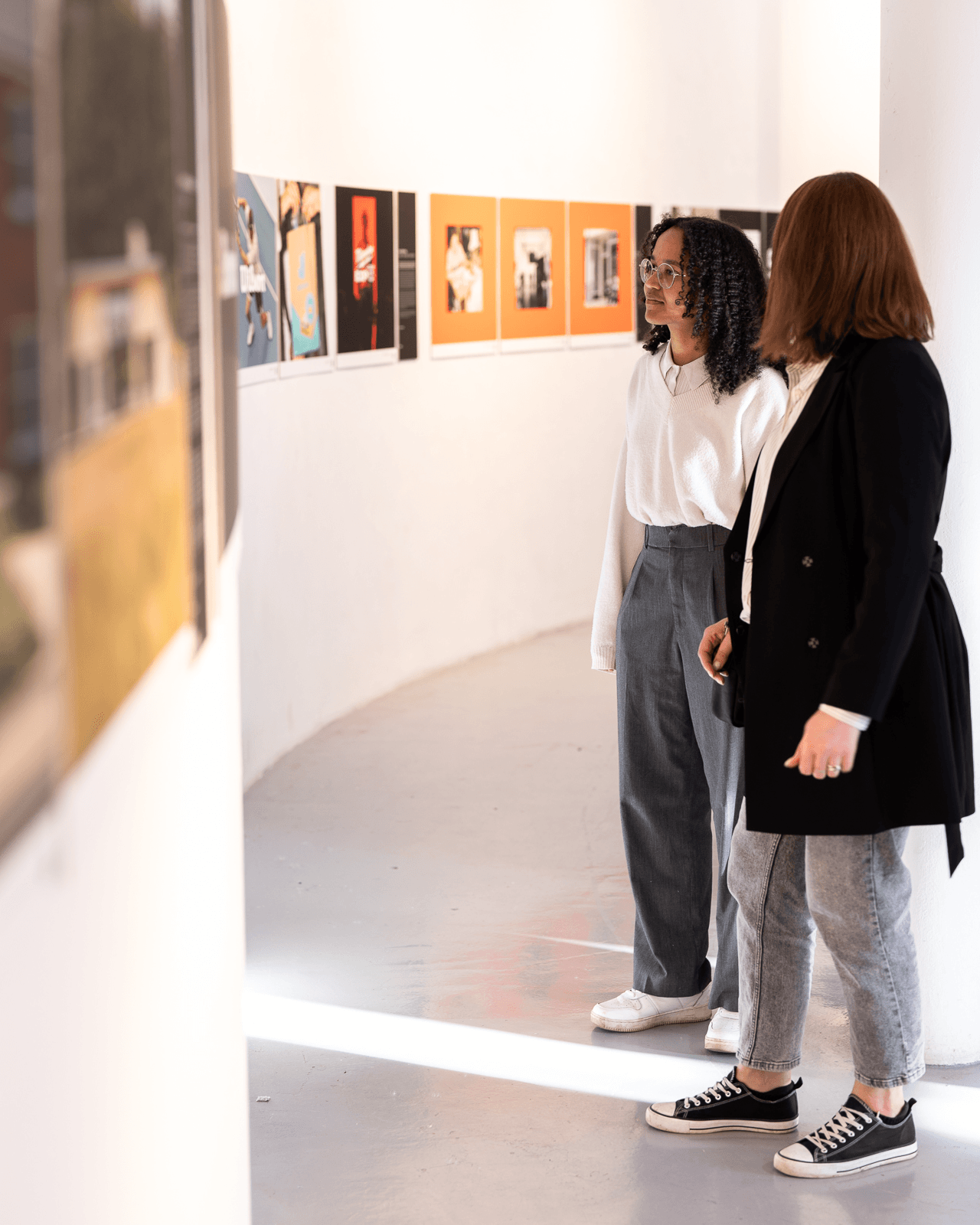
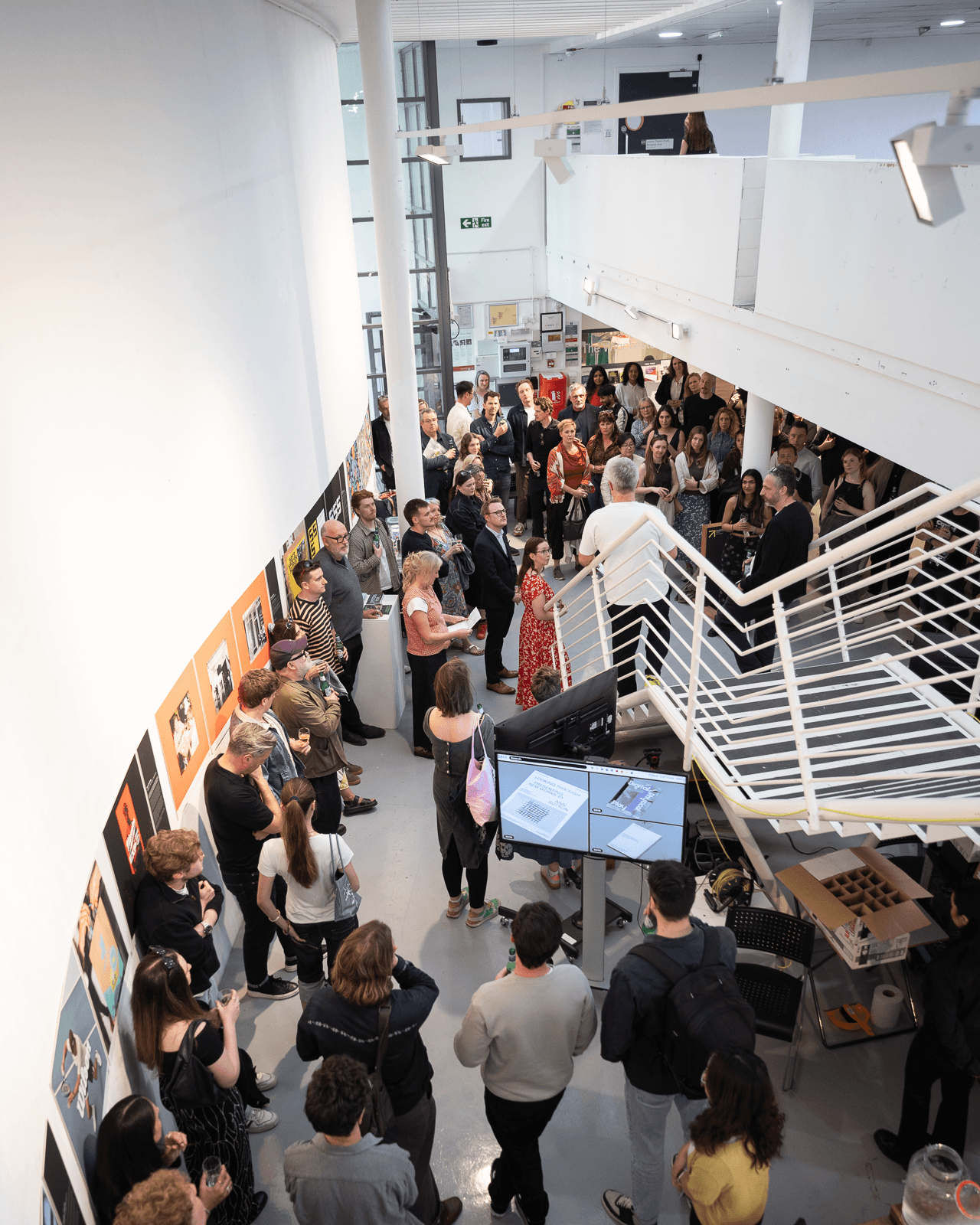
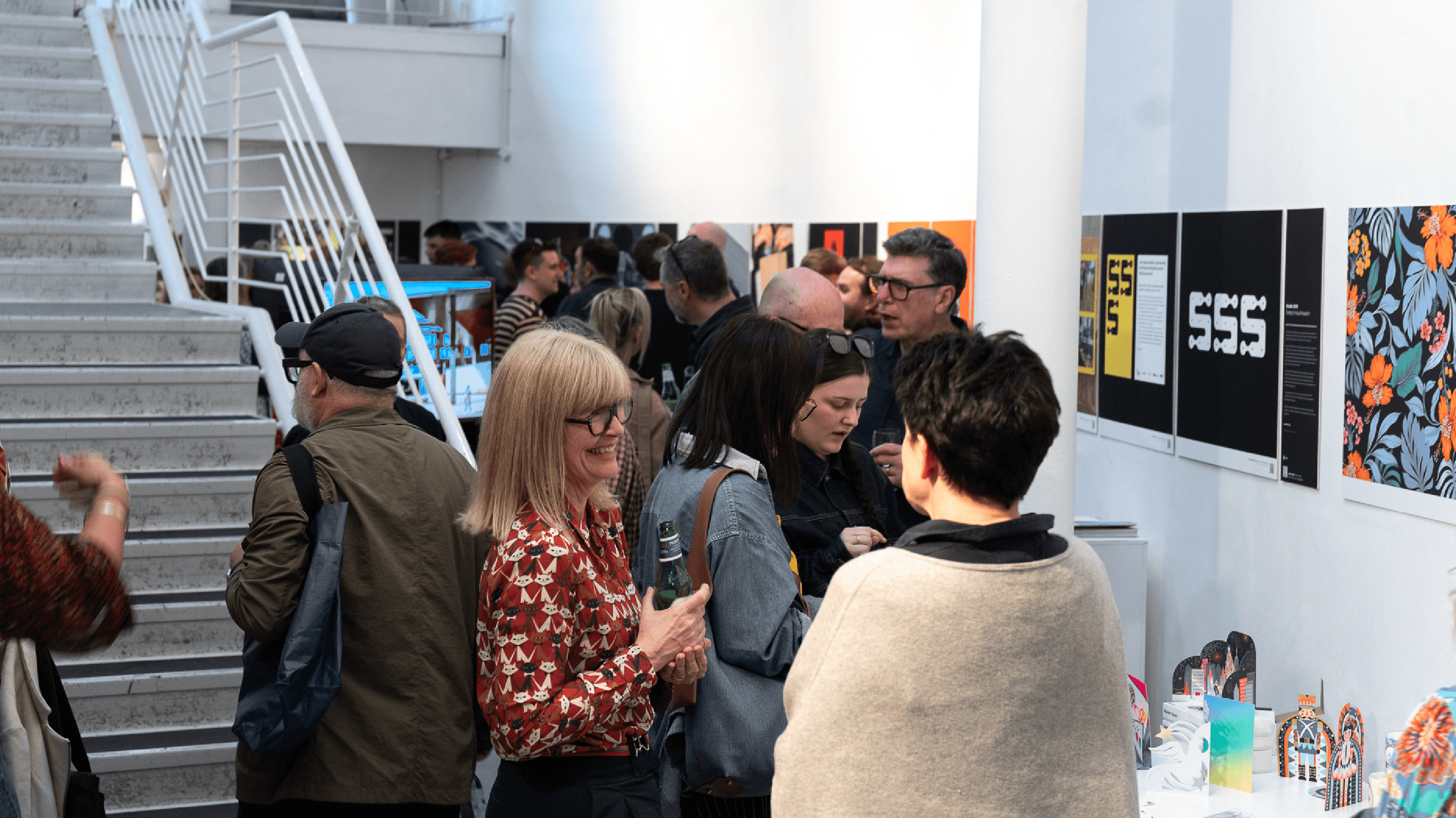
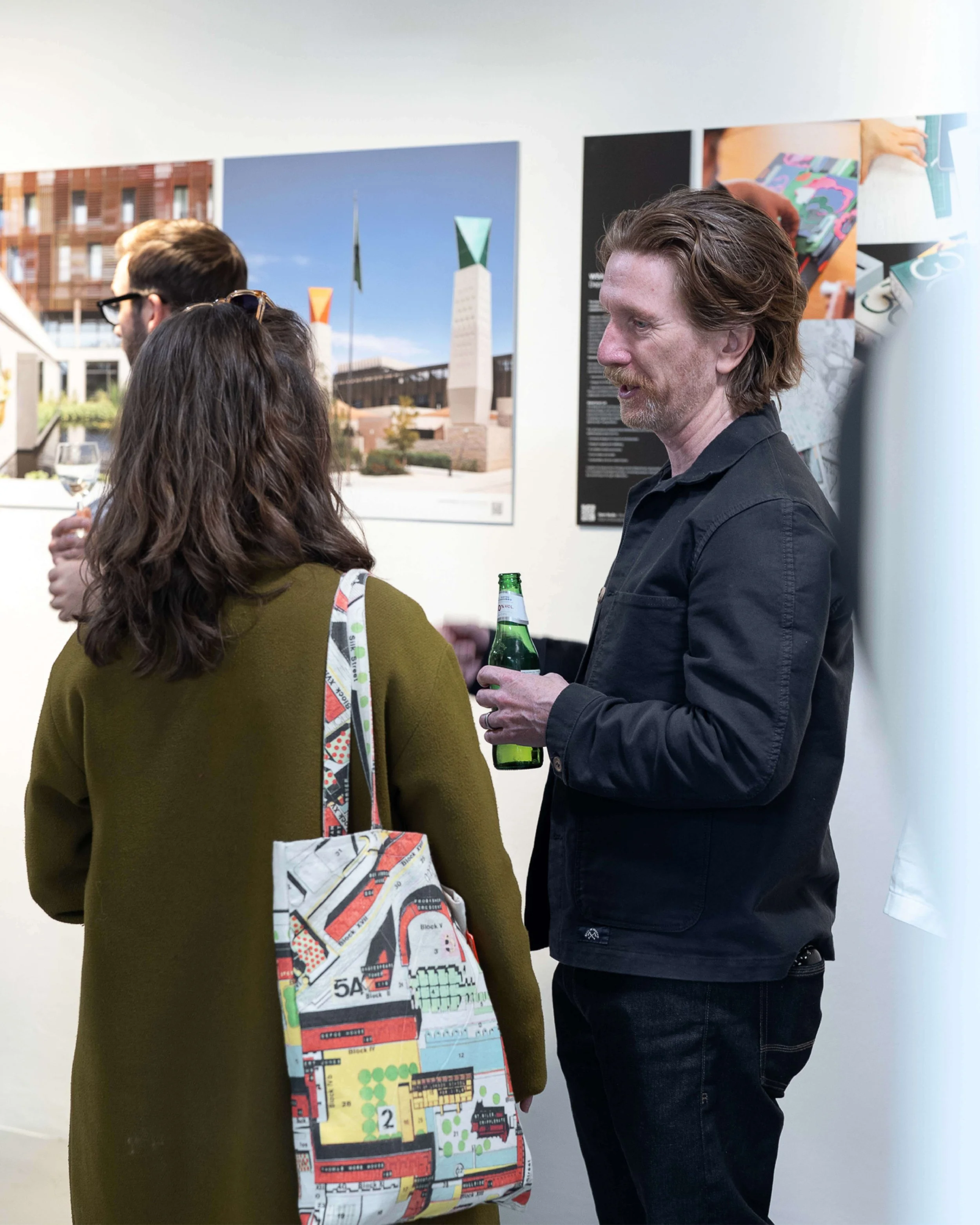
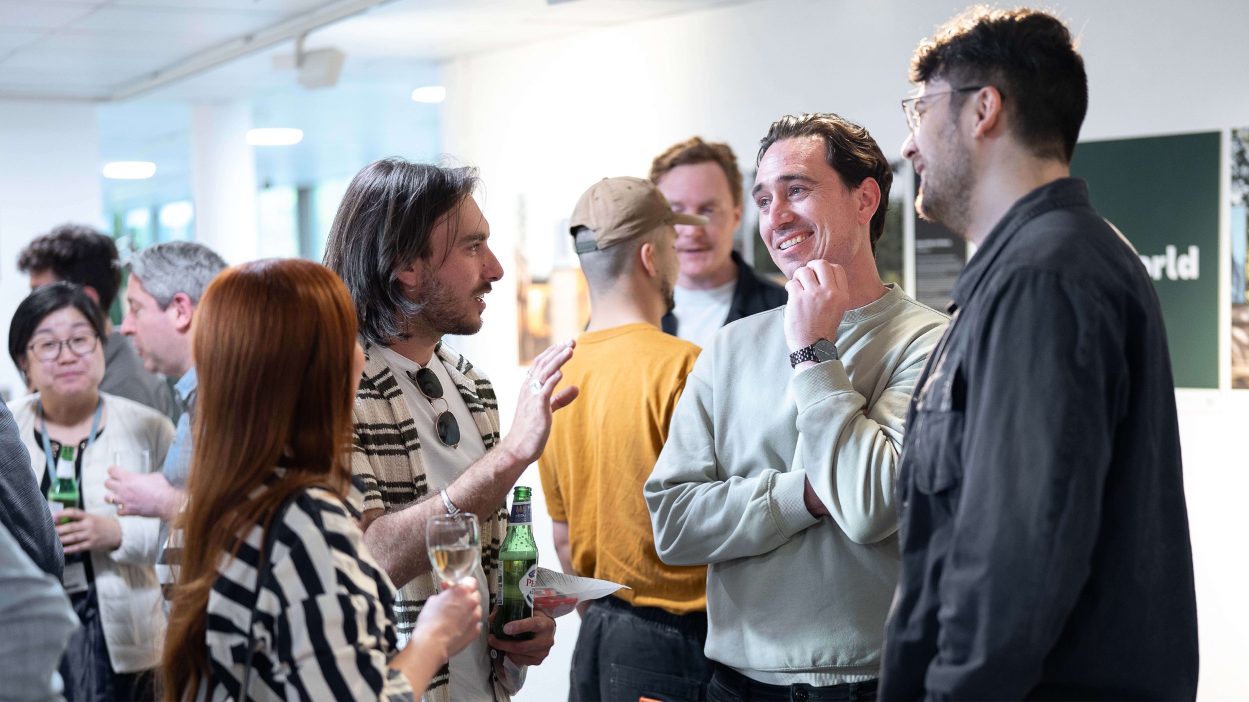
This enticingly-named festival was to be Winchester’s first, specifically for the creative industries. Over one weekend in April, the city’s diverse agencies came together to showcase the breadth and depth of local talent and open their doors for rare, behind-the-scenes studio access. The festival was conceived and organised by Industrial designers Rodd Studios, who also hosted a 24hr design challenge bringing together professionals and designers-in-training from WSA to tackle a social innovation project. WMT was asked to design meaningful visuals and a platform for promotion and engagement.
PROJECT
Visual Identity
Website
The brief
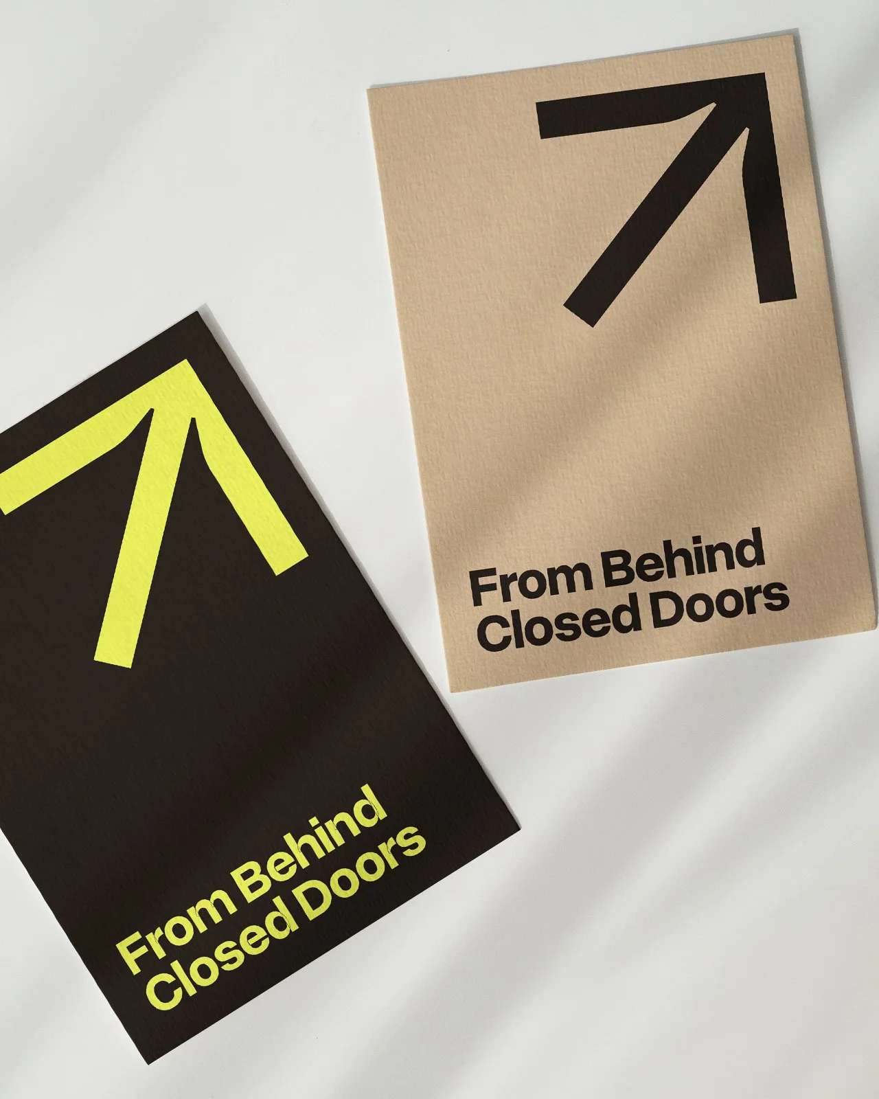
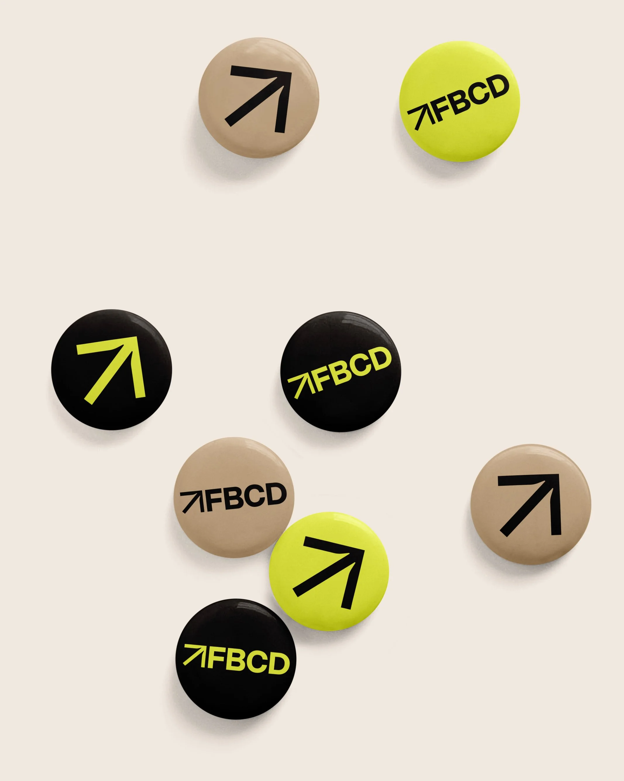
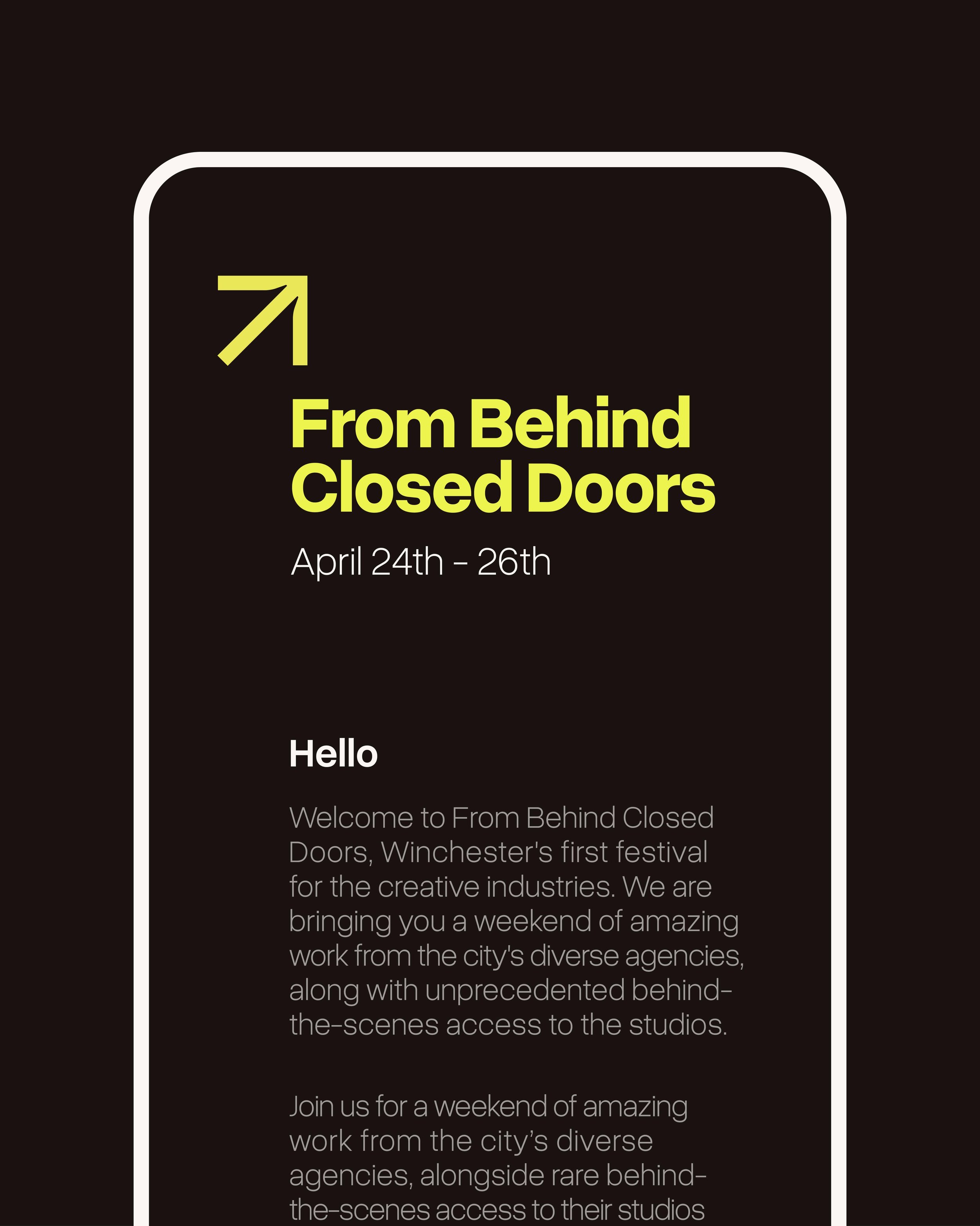
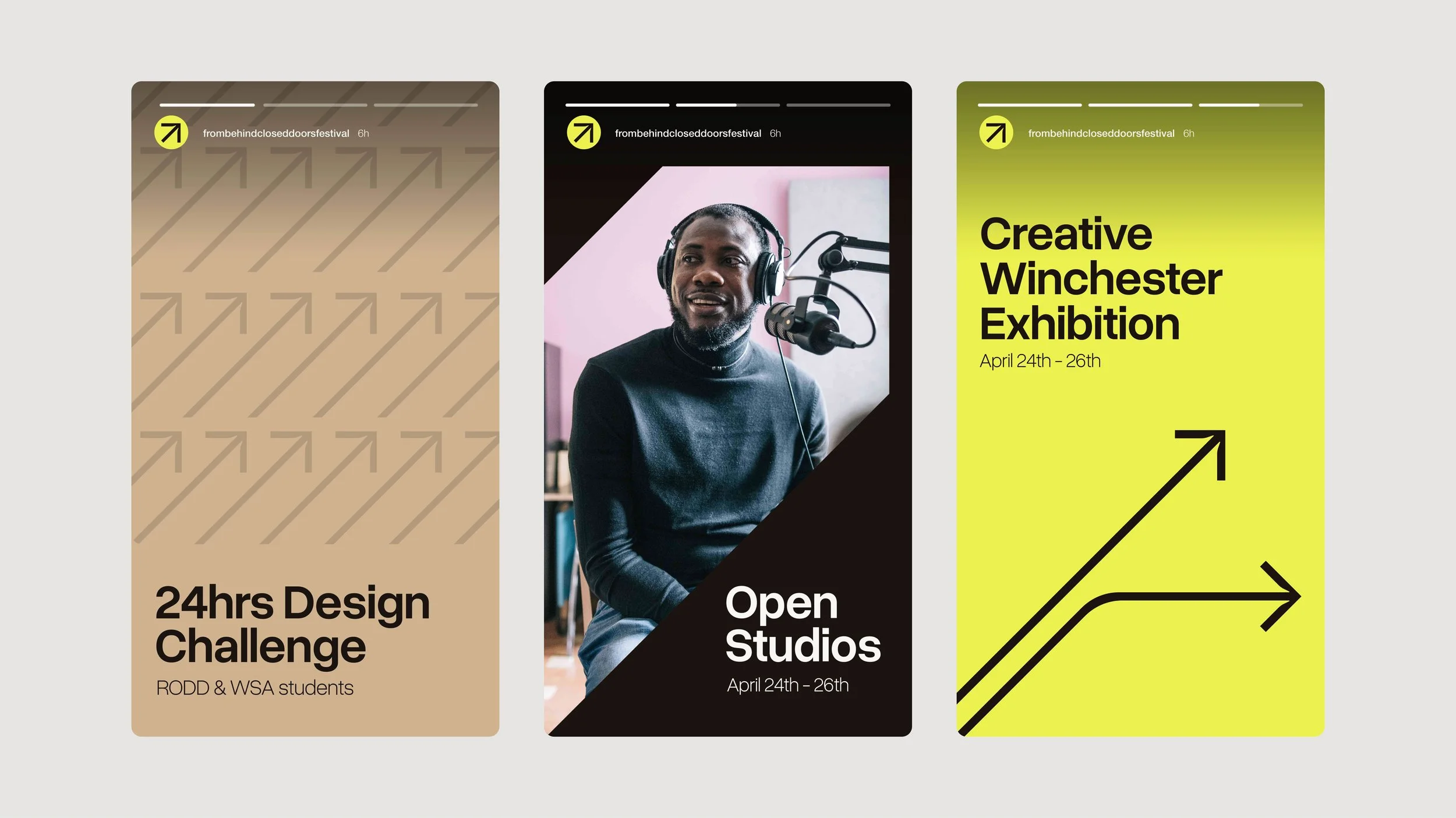
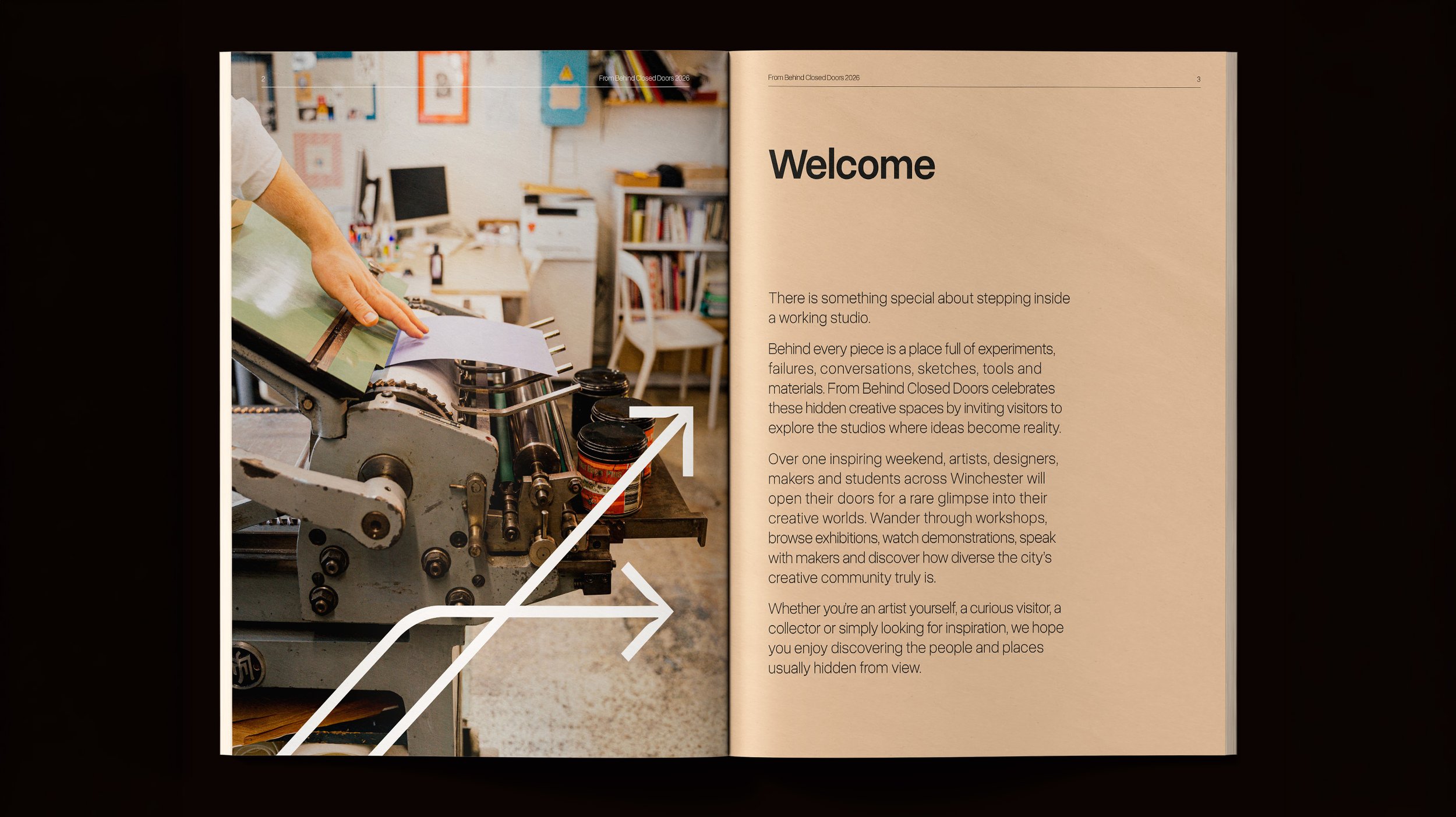
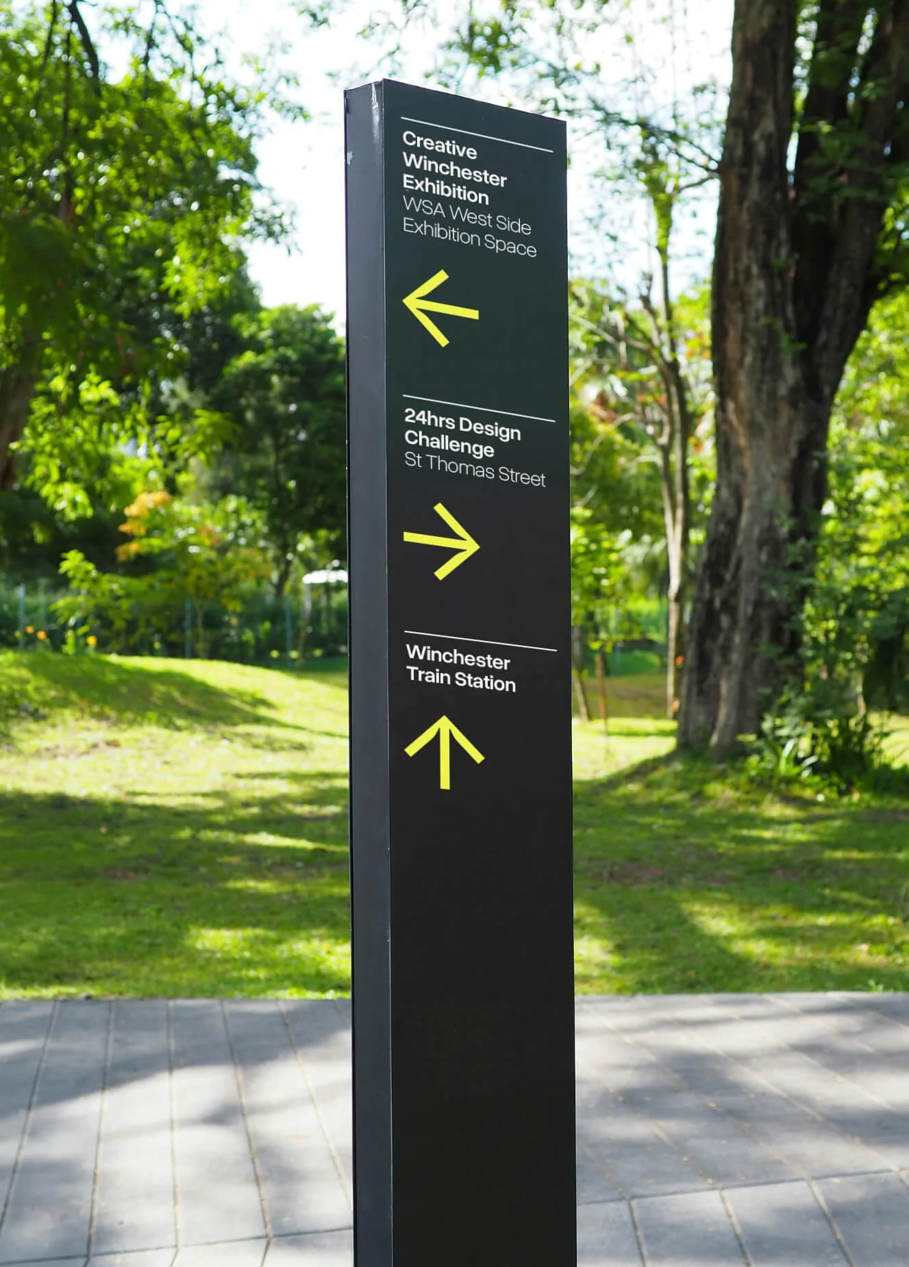
The idea for a simple, 'open door' arrow marque was already in place, but it lacked distinction and needed to be developed into a more complete design system. We wanted to refine the marque into something that would work alongside the variety of creative disciplines and styles. In some circumstances, it needed to be powerful and primary, and in others, more recessive and secondary to the studio's work.
The solution
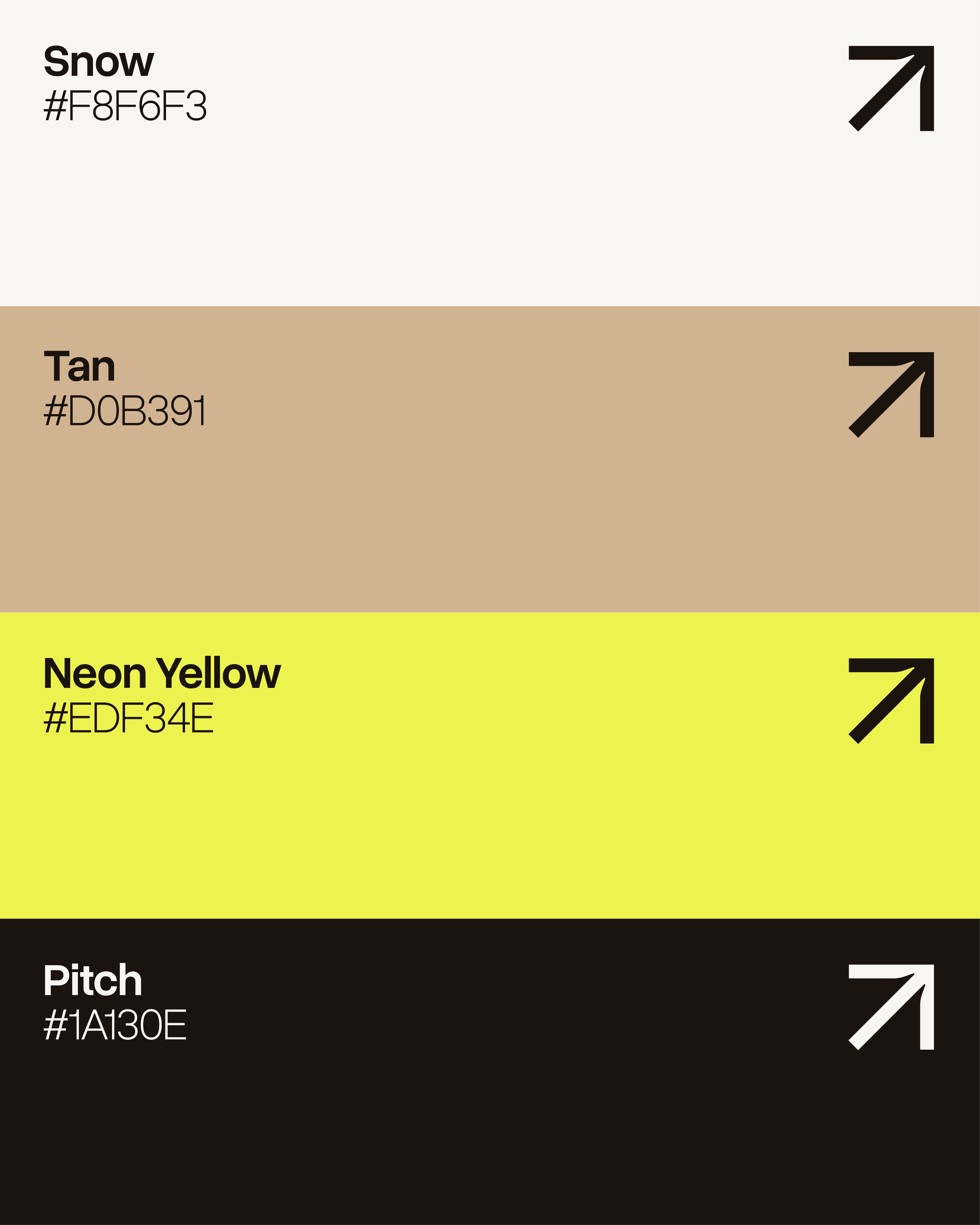
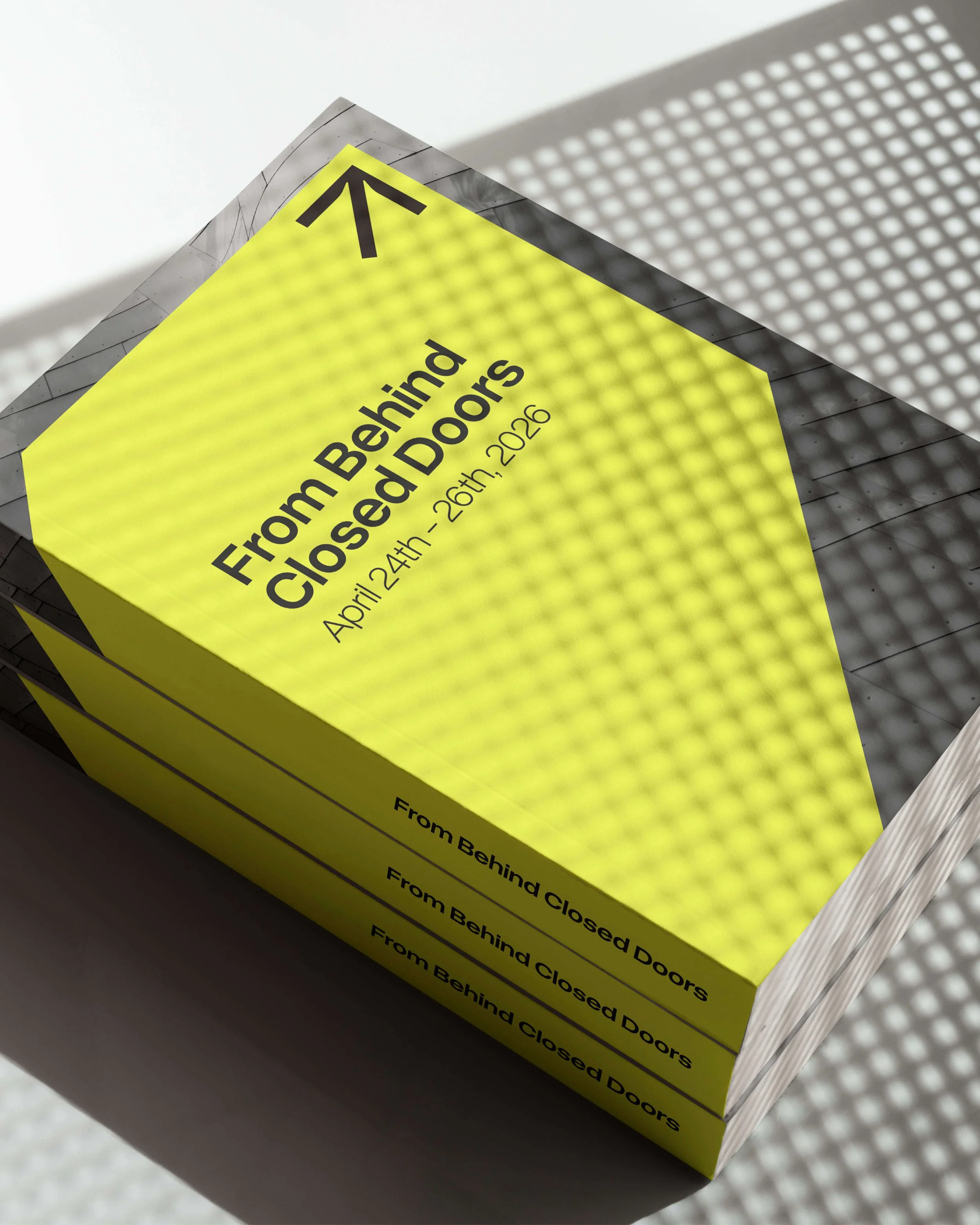
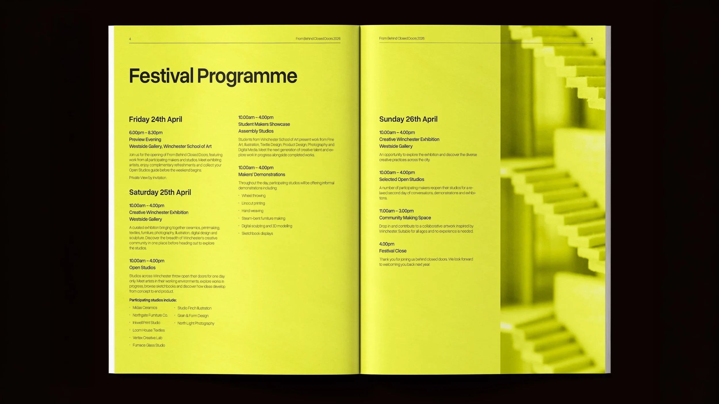
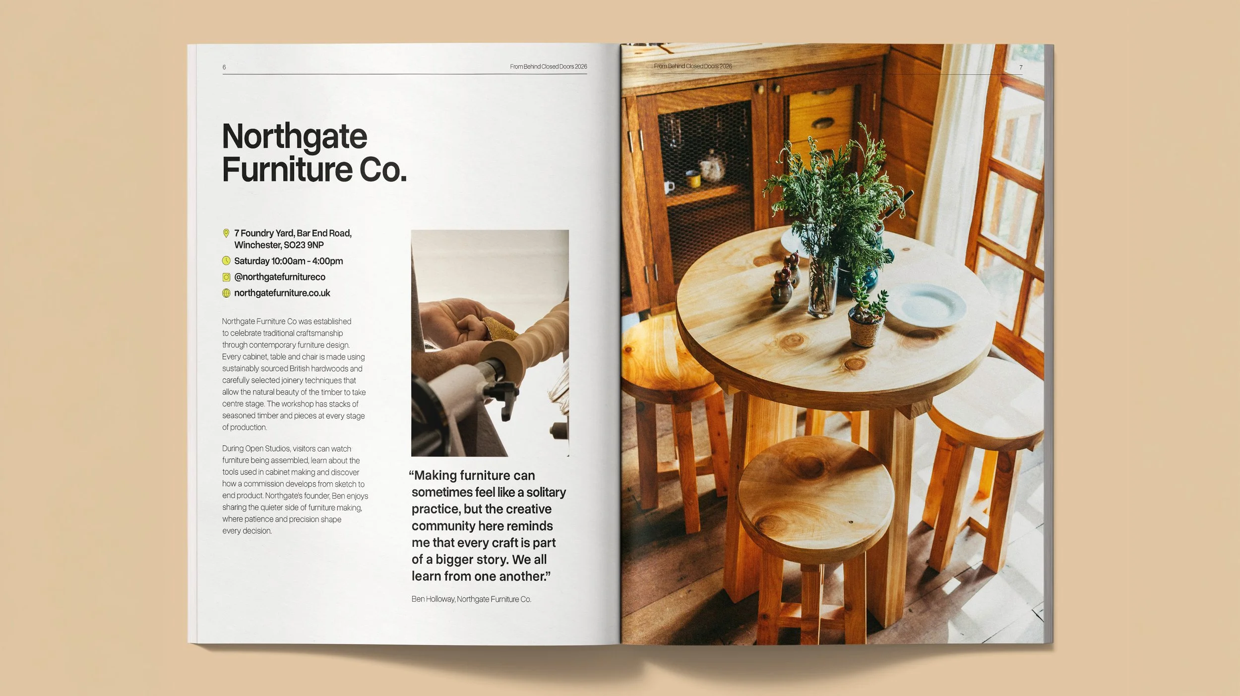
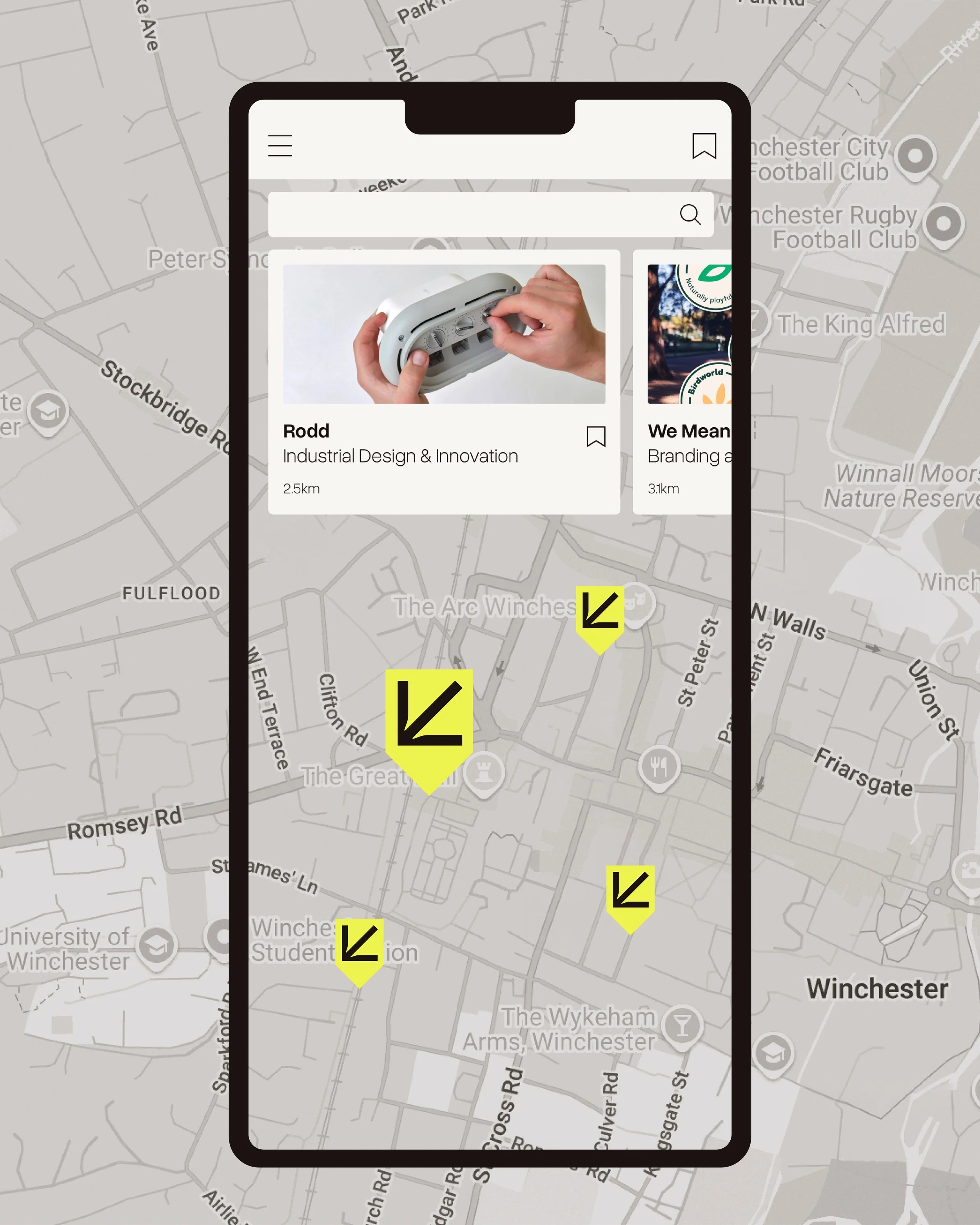
We developed a colour palette that could flex between a 'scroll-stopper' yellow and a more muted secondary palette. We added ink traps to the arrow to give it a more refined and typographic feel and paired it with Overused Grotesk, a neo-grotesque sans-serif that fits the Swiss (OG is based on Helvetica), minimalist approach the brief called for.
CLIENT TESTIMONIAL
“"
– Person